
Dark purple wordmark · light pagesSVG

 Design reference
Logos, type, colors, components, and page patterns for building recognizably Foam pages. Use the landing page rules when creating a page.
Use the official dark purple wordmark on light pages and the white wordmark on dark pages. The brighter purple variant remains in the source set.


For headers and light-mode footers, use the small dark purple wordmark. Dark-mode headers and footers use the white wordmark.
DM Sans is the Foam typeface. Start visible text at weight 500, then use 600 or 700 for emphasis. DM Mono is for technical interfaces.
The brand JSON includes the complete type scale. Earlier Regular styles remain in the catalog; use 500 as the minimum on new pages.
This page shows only colors approved for visible Foam pages. Purple 500 is the primary vivid accent; Electric Purple may appear rarely and at micro scale. Build page rhythm from white, deep purple, and the quiet mineral family. The complete historical source catalog remains in brand.json, clearly subordinate to these usage rules.
Green is for success and confirmation. Red is for errors, including error-specific pages. Neither is part of Foam's main brand palette. Do not use them in landing page illustrations, scribbles, buttons, or chart series.
Legacy orange, yellow, and pale-purple values are intentionally omitted from the visible palette so this reference cannot be mistaken for approval to use them. Green and red keep status-only roles.
Create rhythm with a few large full-bleed fields in fog blue, mineral blue, deep slate, white, and Purple 700. Keep cards white or monochrome. Use Purple 500 for one decisive moment. Electric Purple may punctuate a thin line, focus state, or tiny indicator, but never a large field. Purple 100–200, orange, and yellow stay out.
A strong color can carry one decisive message.
A technical dark tone adds depth without competing with purple.
Use desaturated mineral contrast for secondary information and keep cards monochrome.
White is the default page background. Dark mode uses very dark purple with white text. The mode button above switches this entire reference.
Black text, a white page, and restrained brand color.
White text on a solid very dark purple background.
All Get started examples share a 40 px pill, 15 px DM Sans at weight 500, and 16 px horizontal padding. Fields are 45 px tall with a light gray fill, gray border, and rounded ends.
Optional marks around a short phrase or proof point. Keep the words in DM Sans Medium and black or white. Use one fine stroke color per mark; the double ring is a restrained exception.


Underline a short phrase or outcome.


Circle one statistic or proof point.


Direct attention to a result or action.
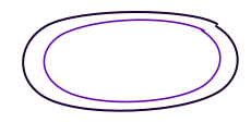
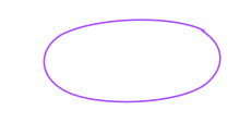
Use two related colors only when the extra line gives a proof point a deliberate, quiet emphasis.


Anchor a short insight with two thin strokes in the same color. Keep the words black or white.


Lead the eye to a result. Keep the line and arrowhead the same color, with space around the words.


The quietest emphasis. Place beneath one phrase or use as a small section divider.


Add motion around a transition or an idea without circling the words.
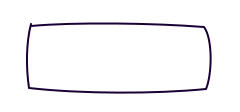

Frame a short quote, proof point, or step in a simple whiteboard sketch.
Loose diagrams for evidence, proportions, and process. Redraw charts from real numbers and label the values when publishing a claim.
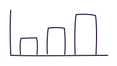

Compare actual quantities. Label axes, categories, units, and the source in a real chart.
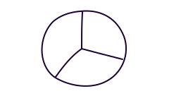

Show parts of a whole. Size slices from real values and label each share.
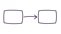

Explain how one thing leads to another. Add a short label inside each box.
Foam Research informs the DM Sans typography. The loose lines and simple outlines take a cue from tldraw's drawing tools. These SVGs are original Foam examples for future pages. Use a thin single-color stroke by default, including for the entire arrow. The offset double ring may use two related purples. Keep one emphasis per idea and avoid gradients and glows.
Use a small set of corner values. The same radii work on white and dark purple surfaces.
Compact surfaces
Content cards
Buttons
Form fields
Use the 30 px and 40 px values for buttons and fields. The 8 px and 16 px values work well for compact surfaces and content cards.
Use these as the default page patterns. Keep their spacing and behavior across Foam pages, while changing the actual link destinations for each page.
69 px on desktop, 64 px on mobile. Use an 82 px desktop wordmark, 14 px navigation at weight 500, one compact action, and a mobile menu.
On main landing pages, use the customer-logo dock and handoff from foam.ai. A fixed, presentation-only copy stays at the bottom edge while the opening content scrolls. An identical strip in normal document flow takes over only when its top edge aligns with the fixed strip's top edge, preventing a blank interval or jump. The fixed copy remains hidden over later sections and returns when visitors scroll back above the alignment point. Mark the duplicate aria-hidden, keep the in-flow strip authoritative, and show only the in-flow strip when JavaScript is unavailable. Keep the white strip slim, use a fine border and grayscale logos, and size wide wordmarks such as Braintrust slightly below the largest customer marks.
Give the footer a little more presence than the content above it: 112 px minimum height, generous vertical padding, a quiet contrasting surface, and a fine top border. Never use a footer shadow. Keep it full-width, square, and structural rather than card-like.
© 2026 Garage Tech, Inc.© 2026 Garage Tech, Inc.Like foam.ai, the footer is a substantial four-column closing section rather than a narrow link bar. Light pages use very light gray #F5F5F5 with dark purple branding. Dark pages use near-black purple #090111, a white logo at 90% opacity, 40% white headings, and 50% white links so the footer stays quiet. Never use greenish footer tones. Keep 32 px column gaps, 32 px top padding, 24 px bottom padding, and an approximately 207 px desktop height.
When adding a landing or main page, ensure a visitor can tell who it is for, what problem they have, why it matters, what outcome they want, what Foam does, how it works, why it is different, why they should believe it, and what to do next.
Use root-relative links for every internal Foam destination, including Home, research, logo links, and footers. A visitor to evals.foam.ai should reach evals.foam.ai/research through /research and return home through /. Make sure each linked route actually exists on that hostname.
<a href="/">Home</a> <a href="/research">Research</a>Record original_subdomain=evals in Foam browser telemetry for that visitor's page views and actions, preserving the entry subdomain throughout the first-party session.
Foam pages should feel mature, editorial, technical, confident, and restrained. Start with a dominant neutral surface and one primary accent per section. Add another accent only when it communicates a real distinction in state, evidence, or comparison.
Do not rainbow-code cards, steps, badges, icons, or metrics. Avoid candy colors, bubbly decoration, excessive pills, oversized rounded shapes, cartoonish symbols, confetti-like marks, and repeated circular badges. When a page feels too quiet, improve hierarchy, spacing, scale, composition, or evidence before adding color.
Never add thick colored top borders, accent rails, cap lines, or partial outlines to cards, panels, or sections. Do not run a colored stripe into or around rounded corners. Use a thin neutral border, spacing, typography, or composition instead. Colored borders are only for a clearly labeled semantic state.
Research uses one modest page title followed by a spacious dated paper index. Careers uses one modest title, Foam's current team portraits and biographies, a short approved roles list, and operating details. Docs uses persistent navigation around compact, readable prose. Support and legal routes use plain editorial documents, not marketing heroes or card grids. Never repeat a page name as both an eyebrow and a heading.
These supporting routes should resemble the corresponding foam.ai information architecture while using this template's approved palette, typography, header, footer, same-host navigation, and telemetry. Keep them quiet: no decorative hero copy, no oversized display titles, no invented claims, and no ornamental panels.
Every Research entry opens a same-host publication page with an abstract or framing section, methods or evidence, labeled results, interpretation, original source, and previous/next navigation. Use a single underline below the title and at most one pointer scribble on the central claim.
The complete rules JSON also covers writing, media, responsive design, colors, and Foam browser instrumentation. Use solid colors intentionally. Orange and yellow remain source-only and must not appear on landing pages. Use the mineral family only for large backgrounds, never to rainbow-code components. Do not use gradients or shadows on page backgrounds, components, marks, or diagrams.